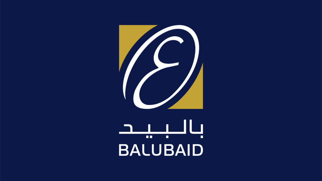
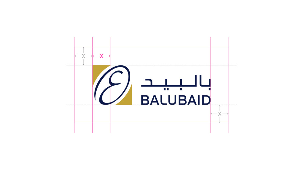
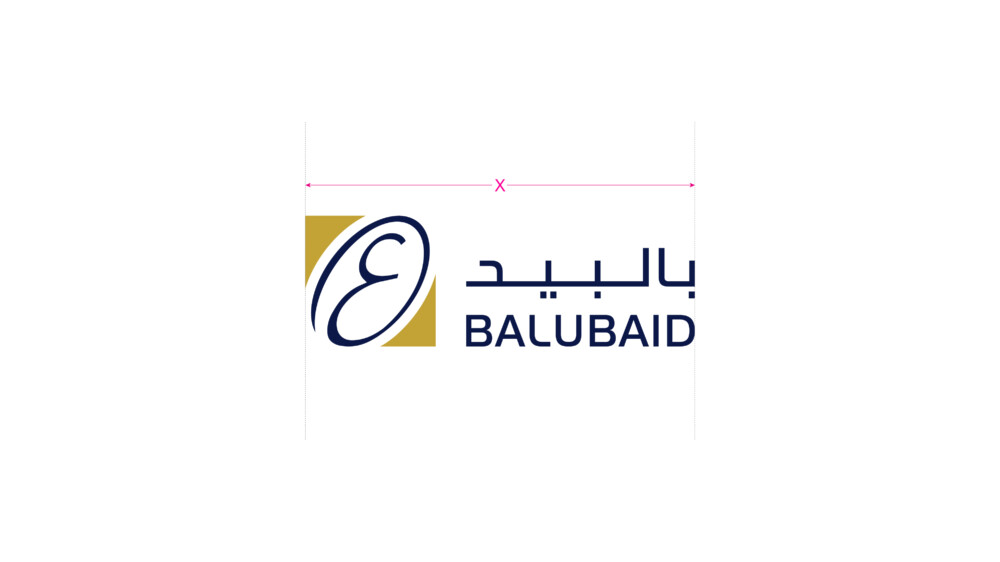
Horizontal lockup - positive
Brand Use
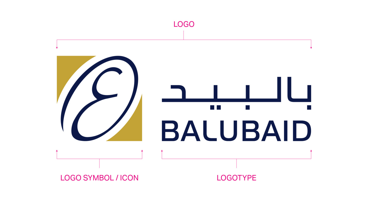
Logo
This is our refined logo for Balubaid where we have refined the balance of logo for stature combined with elegance and strength and a custom drawn logotype. The logo should be used across all brand applications and should always be displayed with clarity and balance in a considered manner.
DO NOT MODIFY THE LOGO UNDER ANY CIRCUMSTANCES.
Consistency in use will create value and trust in the brand and in turn the company.
Logo formats
The following logos are available for the Balubaid brand.
Our logo is available in two different lockups and four colour versions.
Primary Logo – Horizontal format
Secondary Logo – Vertical format
The four colour versions available are:
Positive colour
Negative colour
Single colour
Single reverse colour
Logos should never be modified or distorted. Please follow the minimum size and clear space rules.
Horizontal Format
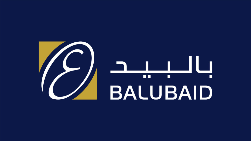
Horizontal lockup - negative
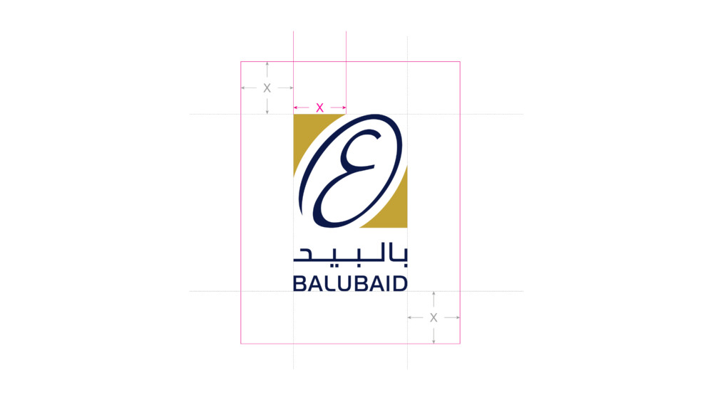
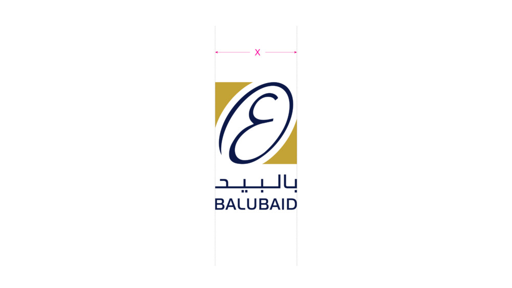
Vertical format
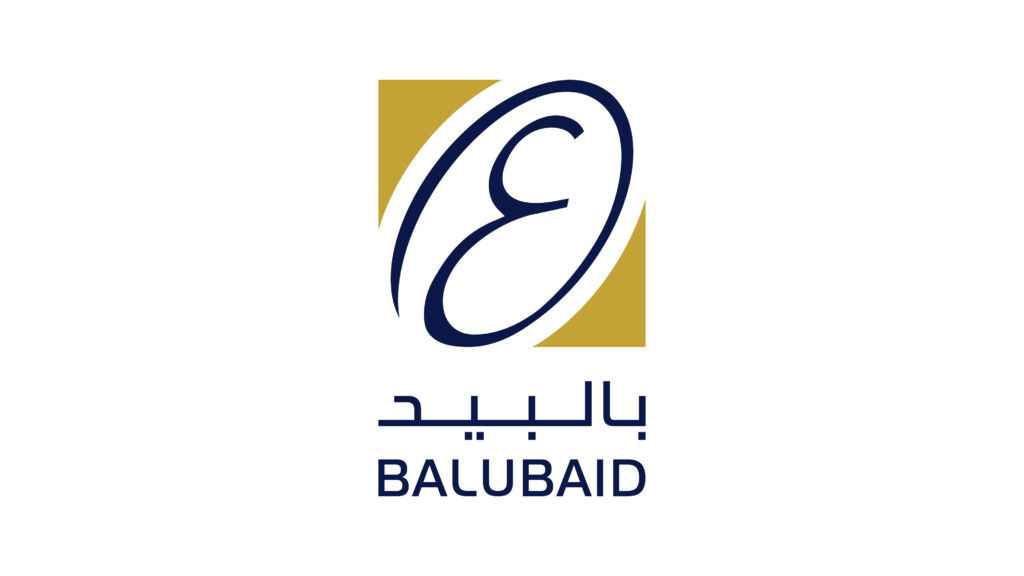
Vertical lockup - positive
Vertical lockup - negative
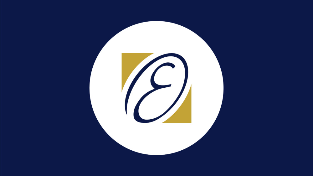
Icon use only
The logo icon can be used independently in applications such as social media profiles or websites where there are requirements such as a favicon. Also for reduced branding opportunities on merchandising.
Other than the applications listed in this section, the logo should always appear as shown in the primary and secondary formats as shown above.
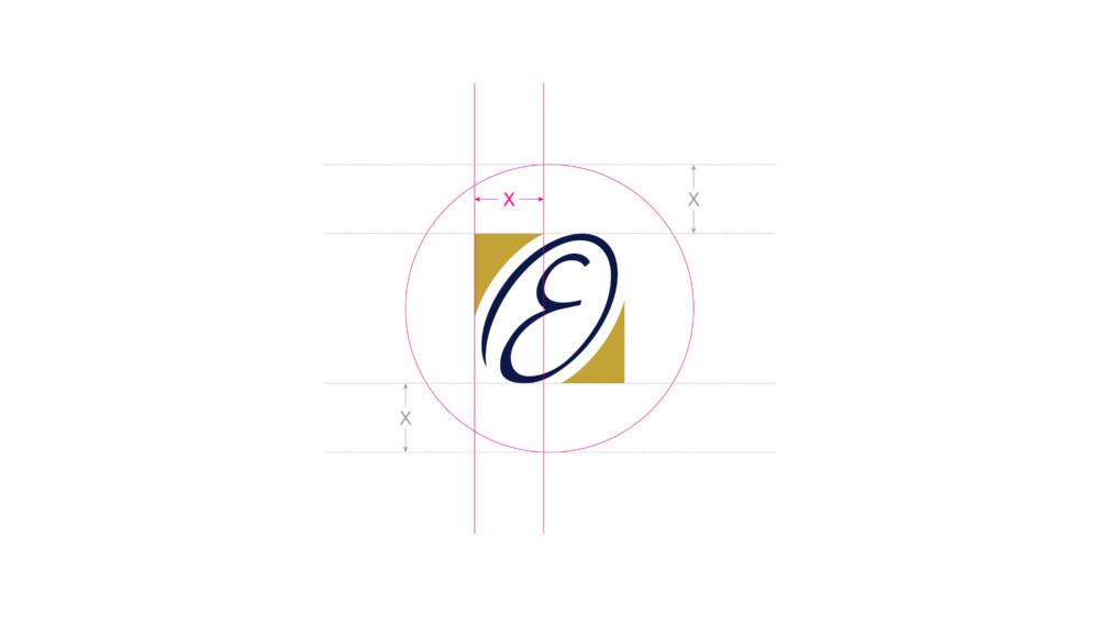
Clear space for the icon is taken from the thickest point of the icon circle highlighted using ‘X’. Use this width – to create the minimum clear space that surrounds the icon.
Minimum width for the icon across digital applications is: 60 pixels wide.
Usage Rules
Clear Space
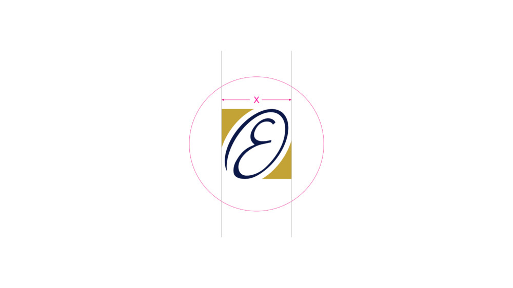
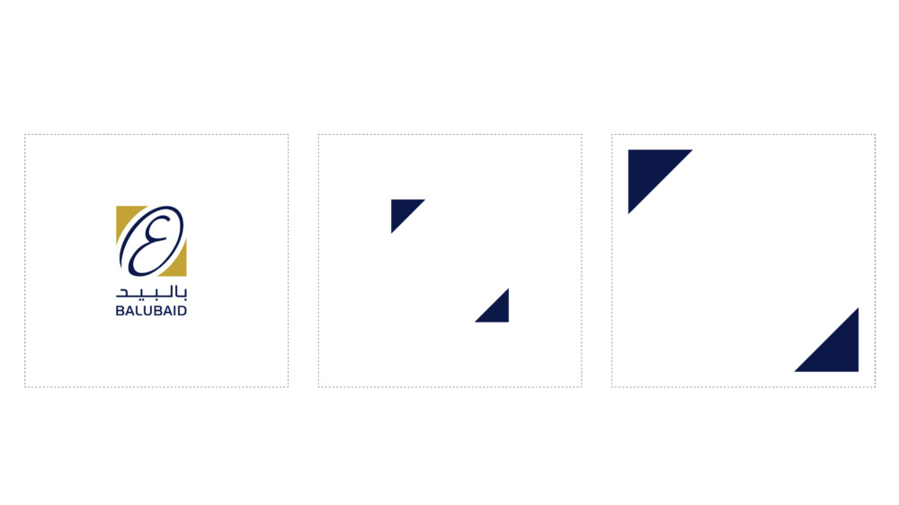
Clear space is equal to the width of the triangle in the Balubaid logo symbol indicated by X. Please ensure no other elements encroach into this area of the logo.
Minimum Size
The minimum size rules should be adhered to strictly. This will ensure the Balubaid logo and symbol are always legible across all applications. Visuals are not shown to scale.
Minimum sizes:
Horizontal Logo – 130px wide
Vertical Logo – 70px wide
Favicon – 40px wide
Typography
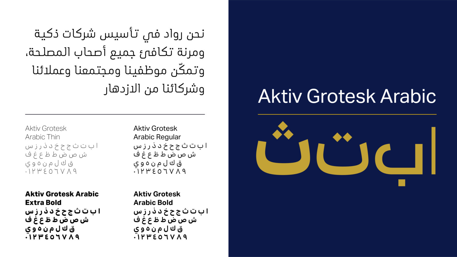
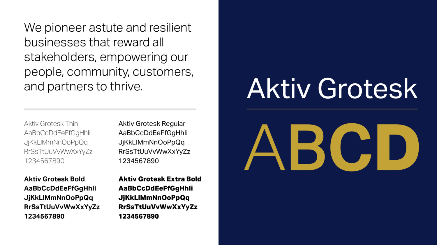
Typography should always be implemented in a clean and structured manner. Particular attention should be given to the weights used for body copy and headlines. Both Latin and Arabic typefaces use Aktiv Grotesk which is available in multiple weights, allowing for the building of hierarchy across different types of information.
Font can be purchased from:
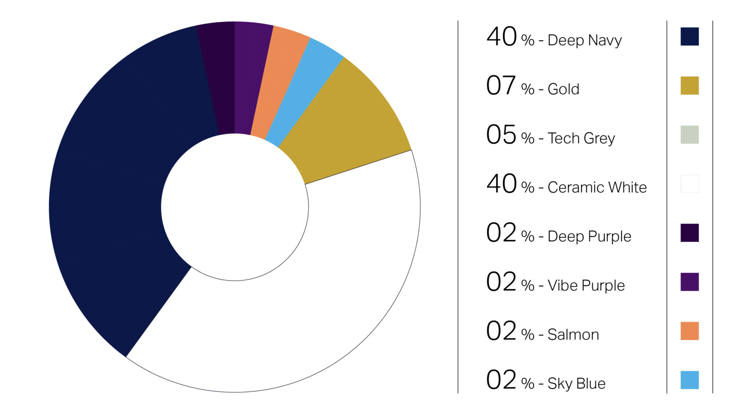
Colour Palette
The following is the brand colour palette for Balubaid and a guide to the ratio of colours that can be used across brand application. The ratios should be followed closely on each layout to maintain the personality of the brand.
The primary colour palette should always be used. Its consistent use will drive brand recognition.
The secondary colours are for highlighting or differentiating of information, such as presentations, and across UI / digital applications.
Deep Navy
#0c1848
C 83. M 67. Y 0. K 72
Gold
#c3a235
C 0. M 17. Y 73. K 24
Tech Grey
#bfc3c9
C 5. M 3. Y 0. K 21
Ceramic White
#ffffff
C 0. M 0. Y 0. K 0
Colour specifications
#280241
C 38. M 97. Y 0. K 75
Vibe Purple
#481067
C 30. M 84. Y 0. K 60
Salmon
#ea8b54
C 0. M 41. Y 64. K 8
Sky Blue
#56afe4
C 62. M 23. Y 0. K 11
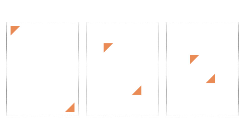
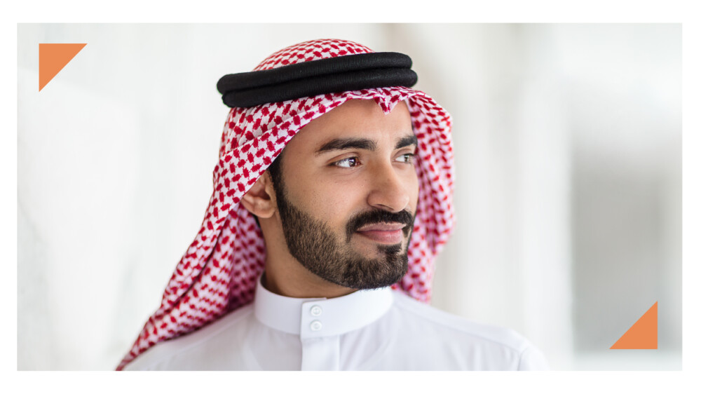
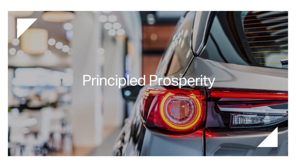
Graphic device
‘Principled prosperity’ graphic device
Framing device
Dual triangle forms that act as framing or focusing device. This can be used in the following manner.
a. Highlight a heading
b. Frame a piece of text
c. Frame an image
d. Focus on a part of an image
e. Frame an info-graphic
Secondary graphic devices
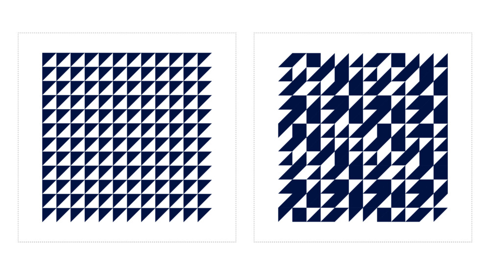
Community Texture
The standard texture take the basic triangle form from the graphic device and creates a repeatable pattern.
This pattern can be used as a subtle background component across the entirety of the brand such as digital background or in branded environments as a complementary texture.
This should never become a dominant element across the brand.
Dynamic Texture
A variation on the above, utilising the pattern in a more dynamic manner, with the triangle forms randomly orientated.
Use this texture in the same manner as the standard texture when a more dynamic aesthetic is required.
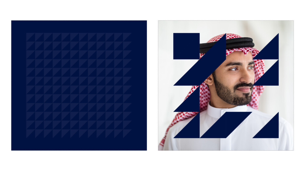
Framing Texture
Utilising the dynamic texture – here we remove specific areas of the texture to frame or reveal an image. This framing texture can be used in conjunction with typography / photography or information graphics.
Use this with restraint.
Dynamic graphic
Pathways to Success
The following are a set of textures that can be across the brand that represent the brand idea of Pathways to Success.
These textures should be used with restraint and can be used across a variety of applications such as covers / and ambient backgrounds in branded environments.
See the brand applications section to learn how to best used these textures. There are a total of 14 variants – all of which can be, and should be used in equal measure across the entirety of the brand.
Download package features all the 14 texture variants in one folder for convenience.


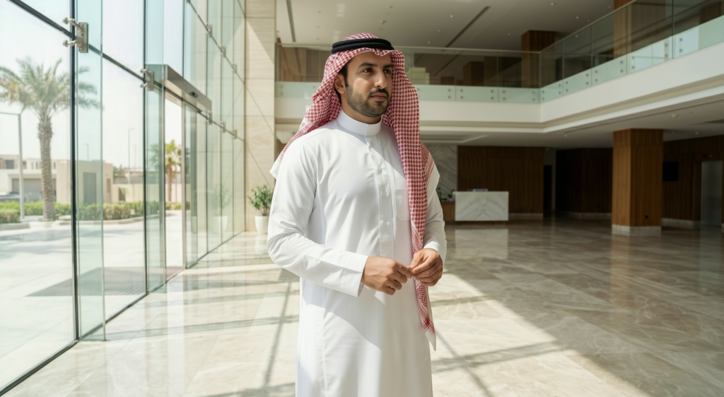
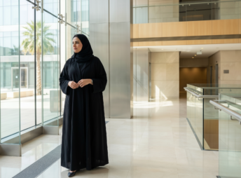
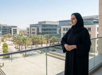
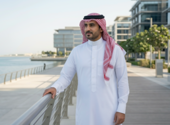
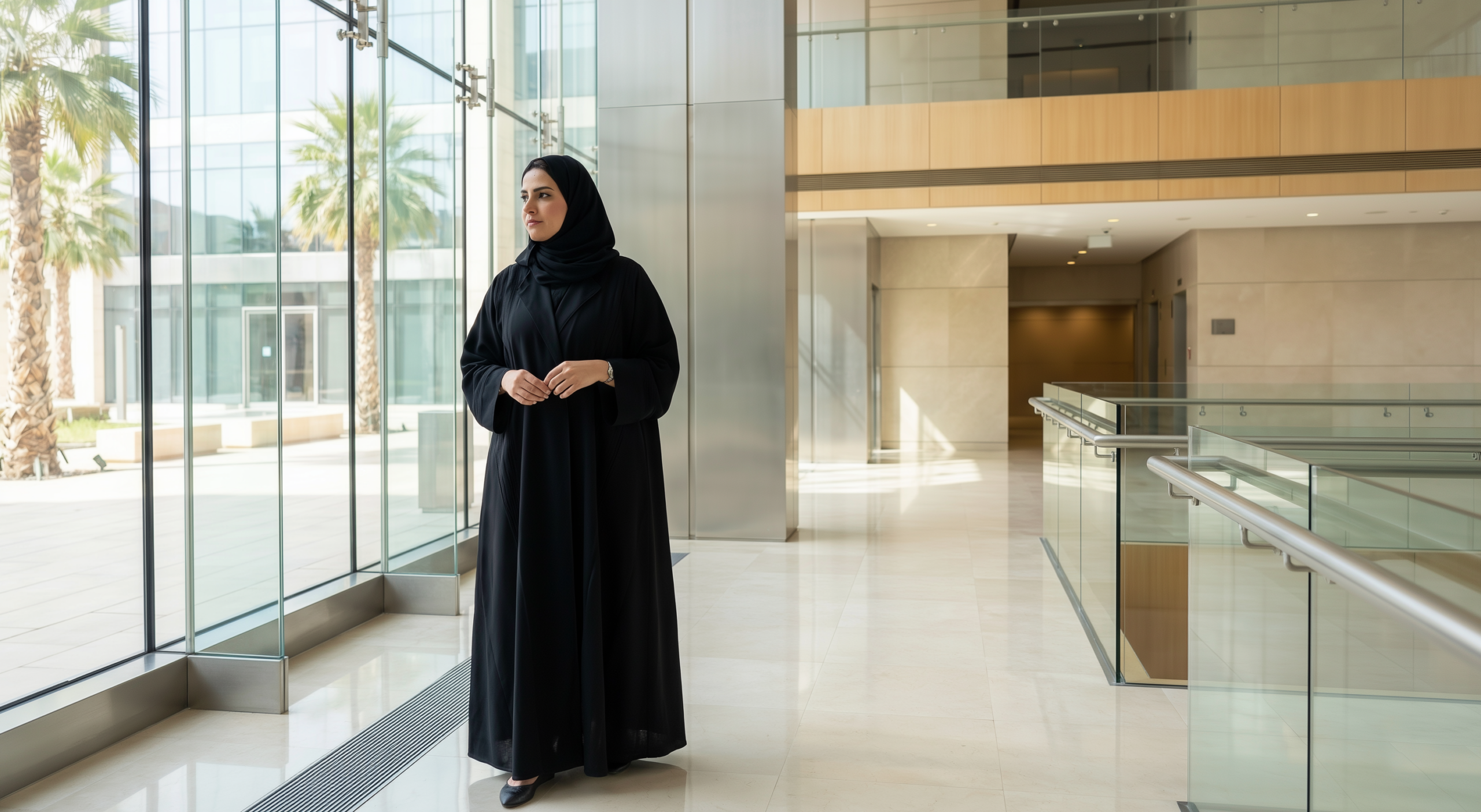
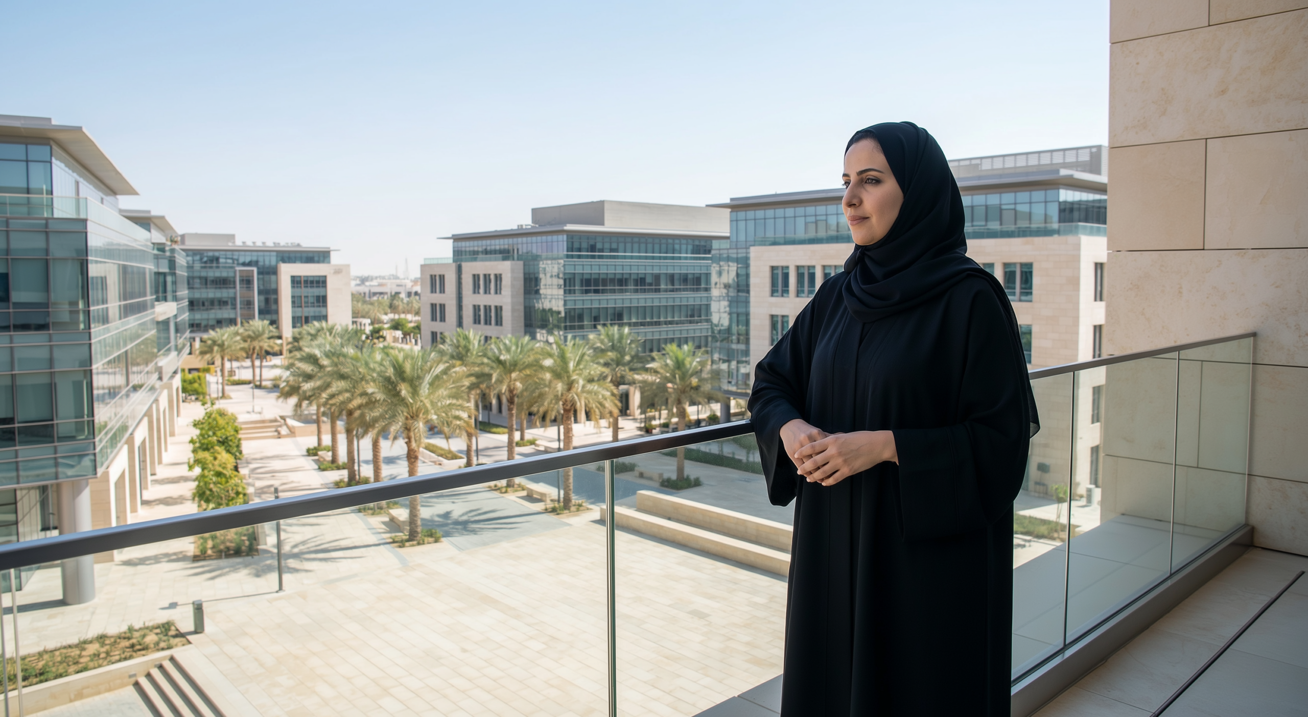
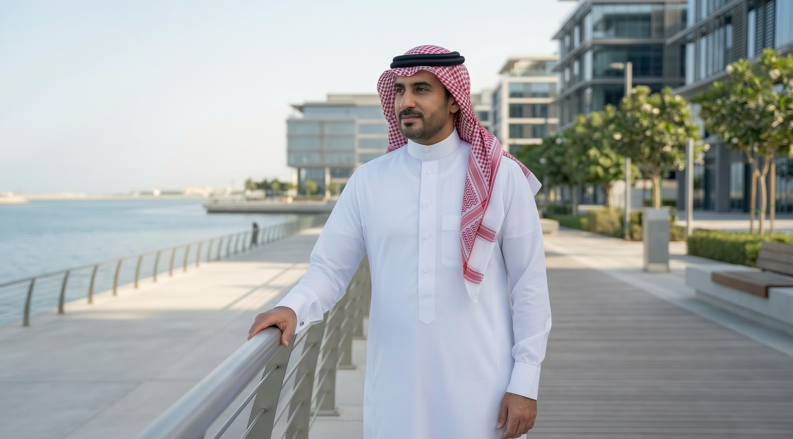
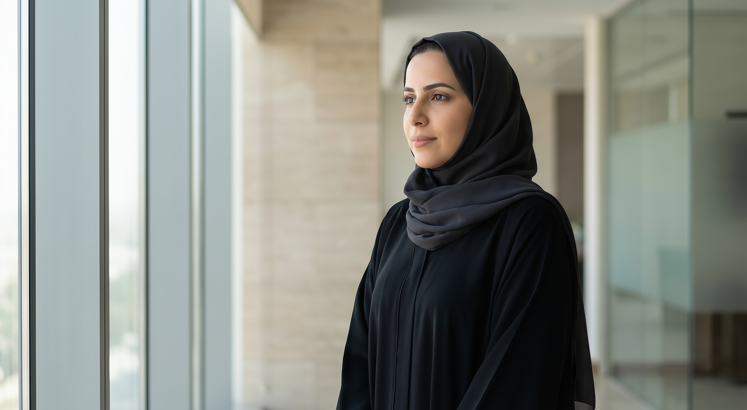
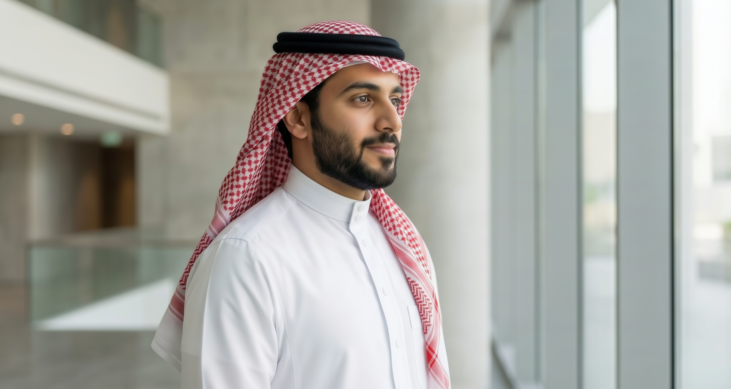
Photography
The following is an overview of the brand photography style. These images should be a foundation to build a wider image library for the Balubaid brand.
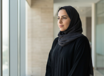
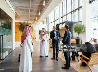
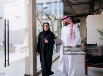
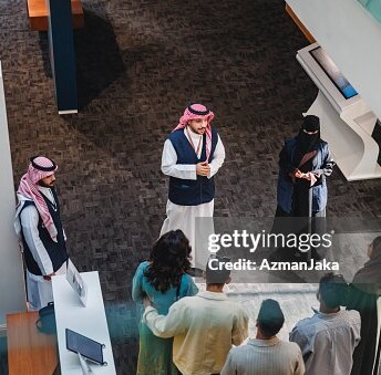
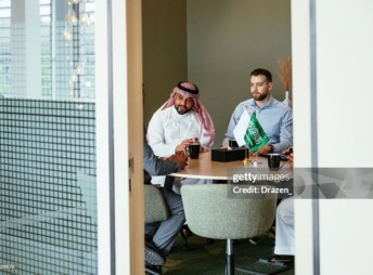
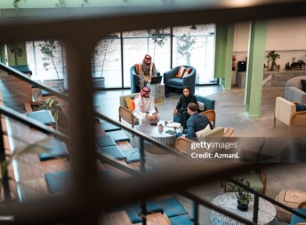
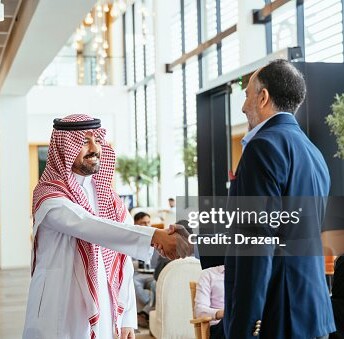
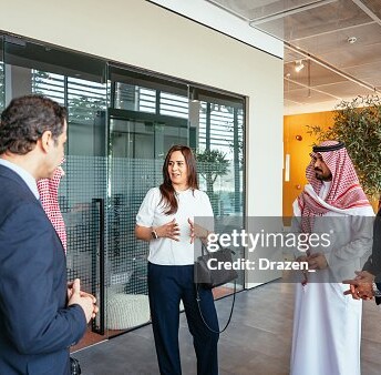
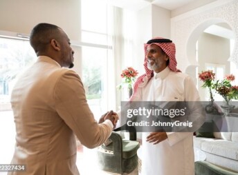
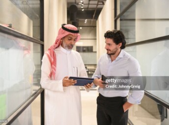
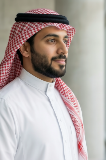
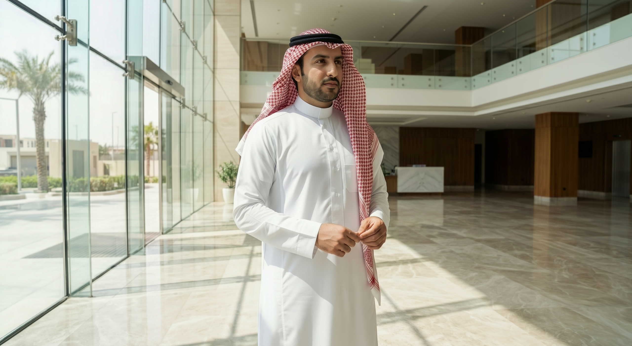
People
Balubaid people photography expresses Principled Prosperity through real people and real moments.
The imagery reflects contemporary Saudi life with calm confidence—human, grounded, and forward-looking. It avoids display or aspiration for its own sake, focusing instead on dignity, trust, and everyday progress.
Environments
Subjects are portrayed naturally within modern Balubaid environments, including contemporary architecture, waterfronts, and landscaped public spaces. Composition is clean and balanced, with eye-level perspectives and generous negative space that allow the subject to feel calm and self-assured. Poses are natural and unforced—standing, walking, or quietly reflecting—never staged, performative, or heroic.
Lighting
Lighting and colour are restrained and true to life.
Photography uses natural daylight only, with soft, even illumination and controlled highlights. The colour palette is warm and neutral, preserving authentic skin tones, materials, and fabric texture. The overall emotional tone is stable, optimistic, and human principled rather than promotional, prosperous without ostentation, and modern while remaining rooted in values.
Avoid
Artificial lighting, heavy styling, dramatic effects, or stock-photography clichés are strictly avoided.
