Positive colour.
This colour version is used on white or light backgrounds and should never be used over images.
Brand Use
Logo
This is our logo for Amakenna The logo should be used across all brand applications and should always be displayed with clarity and balance in a considered manner as shown in the brand applications section.
DO NOT MODIFY THE LOGO UNDER ANY CIRCUMSTANCES.
Consistency in use will create value and trust in the brand and in turn the company.
Logo formats
The following logos are available for the Amakenna brand.
Our logo is available in only one format and two colour versions are available:
Positive colour
Reversed colour
Logos should never be modified or distorted. Please follow the minimum size and clear space rules.
Logo versions
Reversed colour.
This colour version is used reversed out of the brand dark blue and and can also be used to reverse out of other brand colours and images.
Digital icon
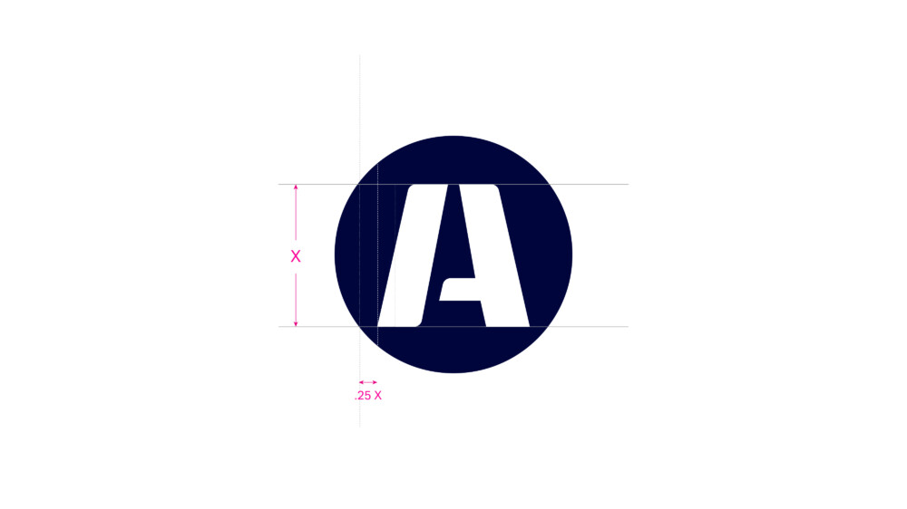
The logo reduces well when used in applications such as social media profiles or websites and also for branding opportunities on merchandising.
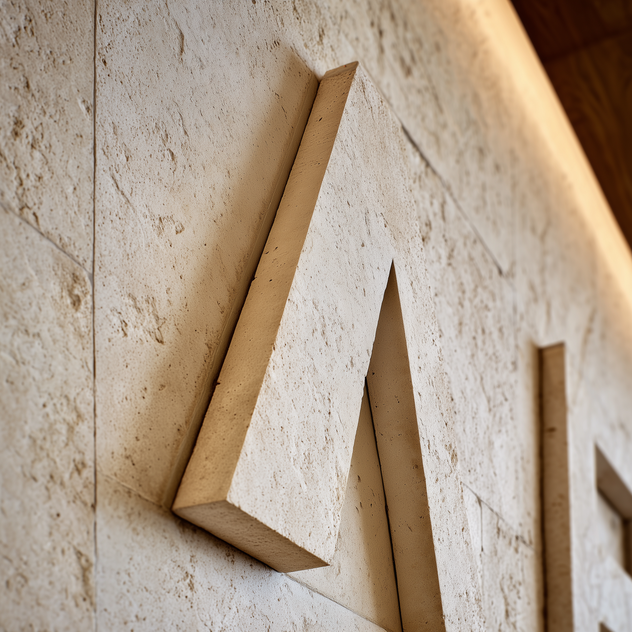
However there might be instances where the full logo is not producing properly fwhen the size requirement is too small to read the full logo. In these instances you can use the ‘A’ from the English name in the logo.
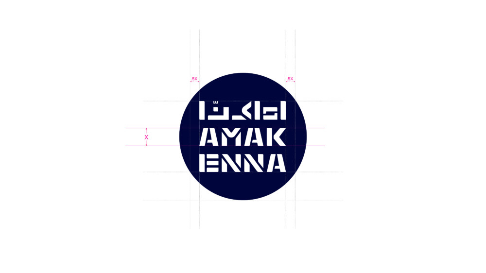
Clear space for the logo is taken from the height of the letter ‘A’, highlighted using ‘X’. Use this height to create the minimum clear space that surrounds the logo.
Minimum width for the logo across digital applications is: 60 pixels wide.
Usage Rules
Clear Space
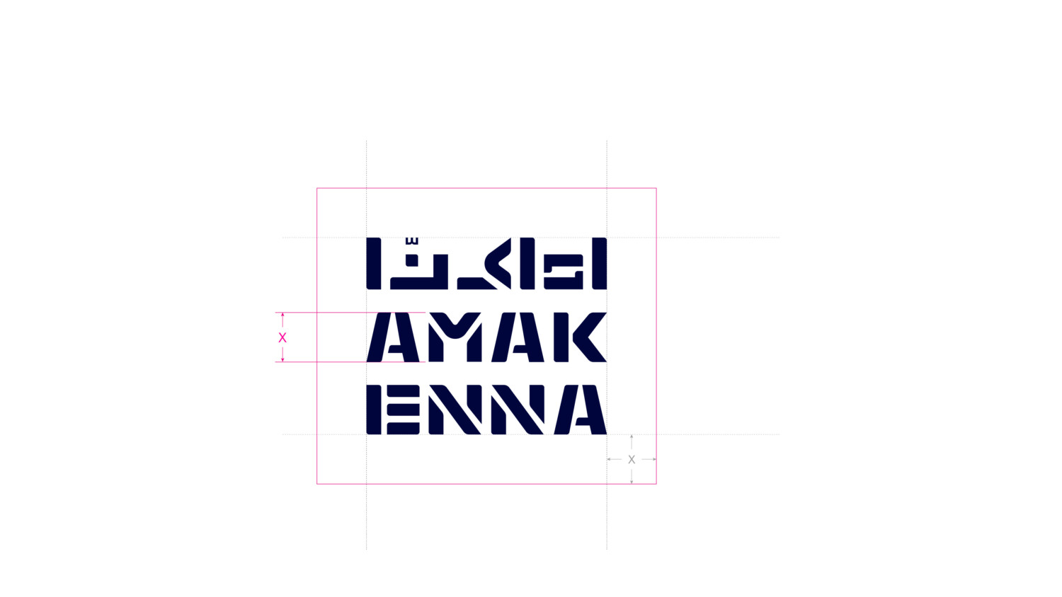
Clear space is equal to the height of the English ‘A’ in the logo indicated by X. Please ensure no other elements encroach into this area of the logo.
Minimum Size
The minimum size rules should be adhered to strictly. This will ensure the logo and is always always legible across all applications. Visuals are not shown to scale.
Logo – 60 px wide
Typography
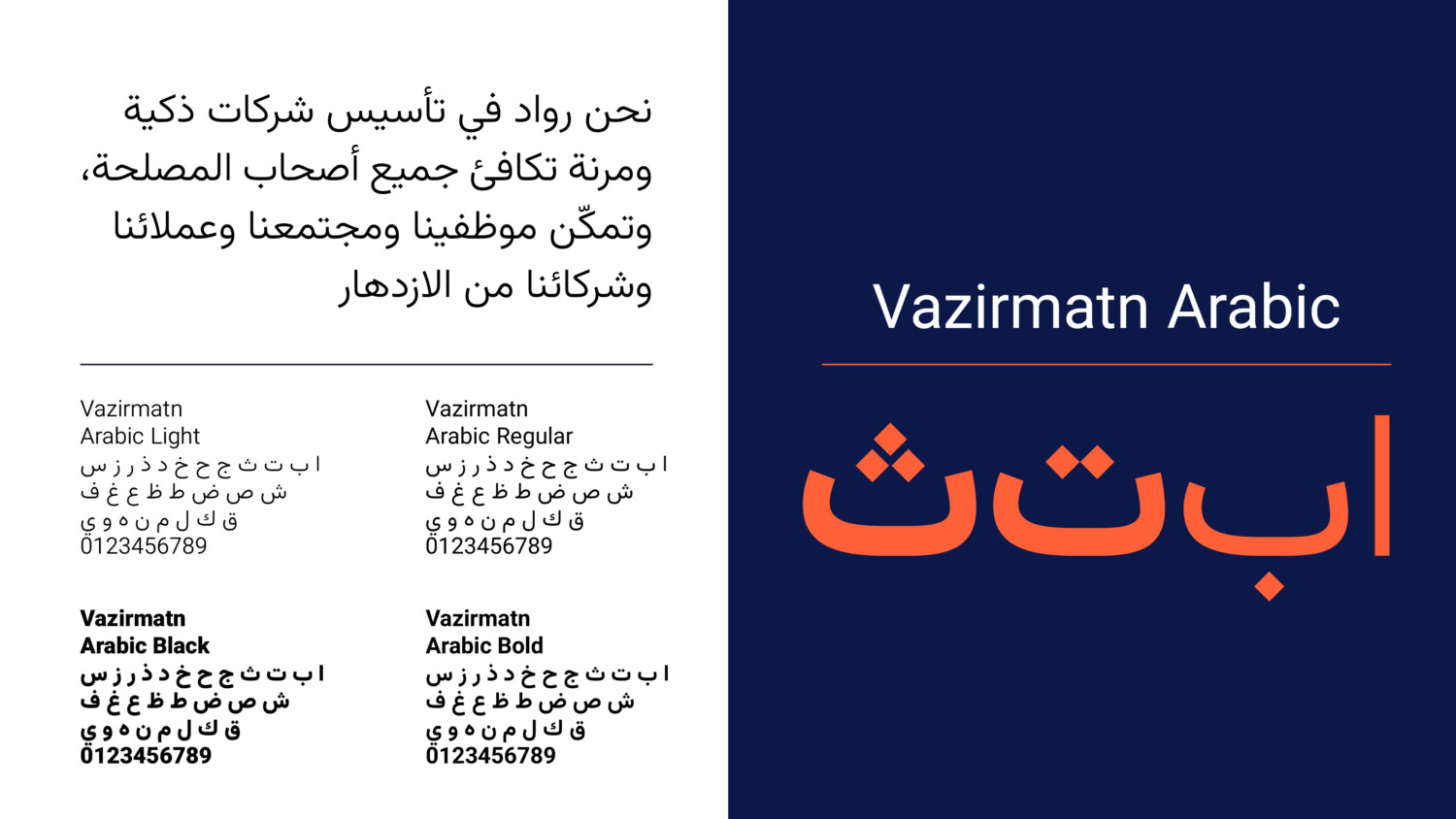
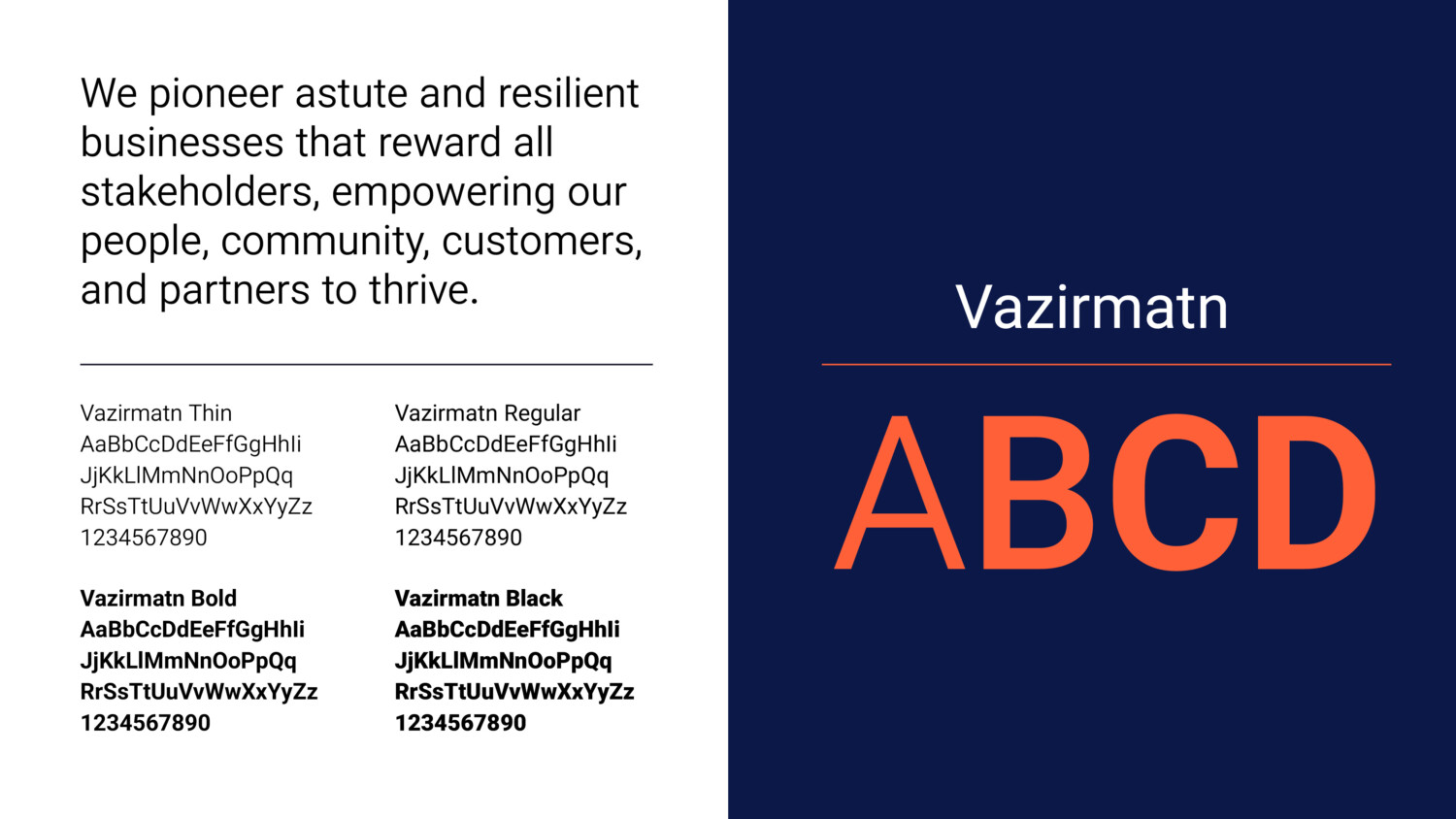
Typography should always be implemented in a clean and structured manner. Particular attention should be given to the weights used for body copy and headlines. Both Latin and Arabic typefaces use Vazirmatn which is available in multiple weights, allowing for the building of hierarchy across different types of information.
Font can be downloaded from Google fonts:
Colour Palette
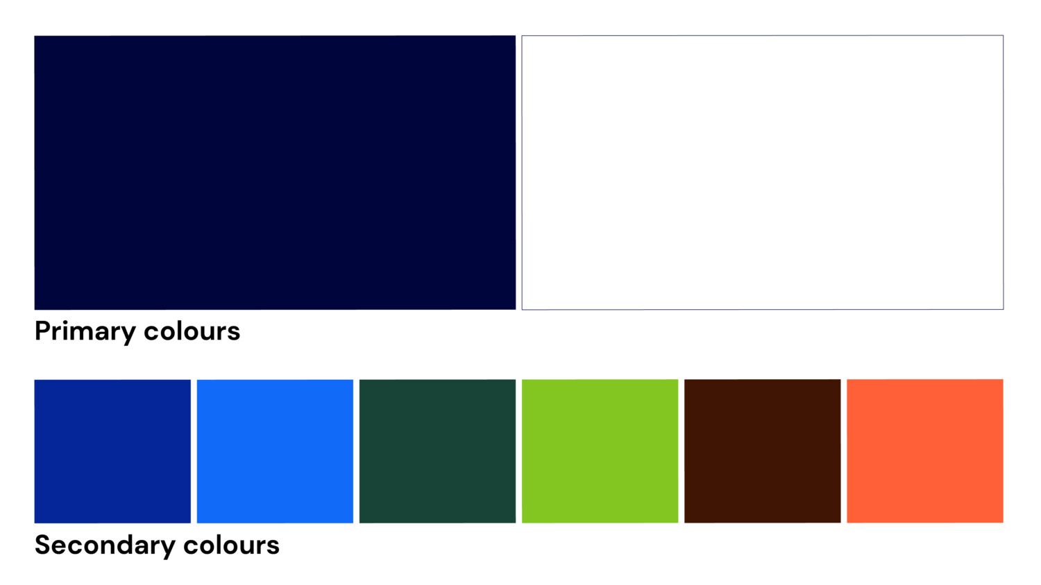
The following is the brand colour palette for Amakenna and a guide to the ratio of colours that can be used across brand application. The ratios should be followed closely on each layout to maintain the personality of the brand.
The primary colour palette should always be used. Its consistent use will drive brand recognition.
The secondary colours are fused in the following way for our core offers (was demonstrated throughout this guideline).
Malls – Cobalt and Cyan blue
Commercial – Warm brown and innovation orange
Residential – Forest and tech green
Colour specifications
Deep Navy
#00063c
R 0. G 6. B 60
C 100. M 90. Y 0. K 76
Ceramic White
#ffffff
R 255. G 255. B 255
C 0. M 0. Y 0. K 0
Cobalt Blue
#042699
R 4. G 38. B 153
C 97. M 75. Y 0. K 40
Cyan blue
#116af8
R 17. G 106. B 248
C 93. M 57. Y 0. K 3
Forest green
#184336
R 24. G 67. B 54
C 64. M 0. Y 19. K 74
Tech green
#83c621
R 131. G 198. B 33
C 34. M 0. Y 83. K 22
Warm brown
#411504
R 65. G 21. B 4
C 0. M 68. Y 94. K 75
Innovation orange
#ff6038
R 255. G 96. B 56
C 0. M 62. Y 78. K 0
Graphic device
‘Integrated delivery’ graphic device
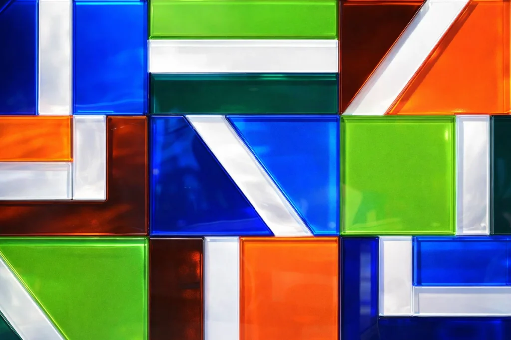
The graphic device is inspired by our process and project delivery. The graphic elements represent an urban plan. The bold shapes reflect our strength of purpose and dynamic approach to planning and delivering places for life.




Materials
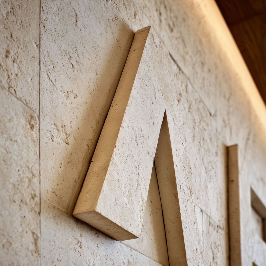
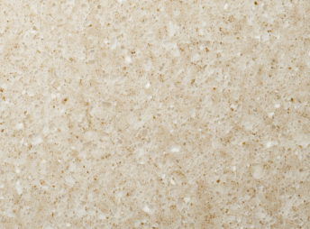
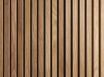
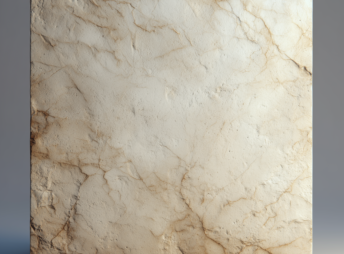
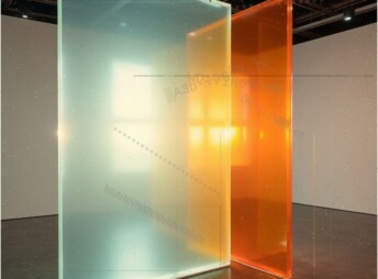
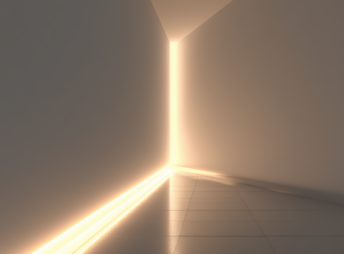
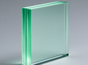
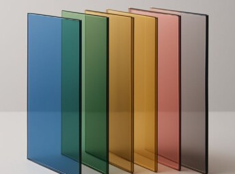
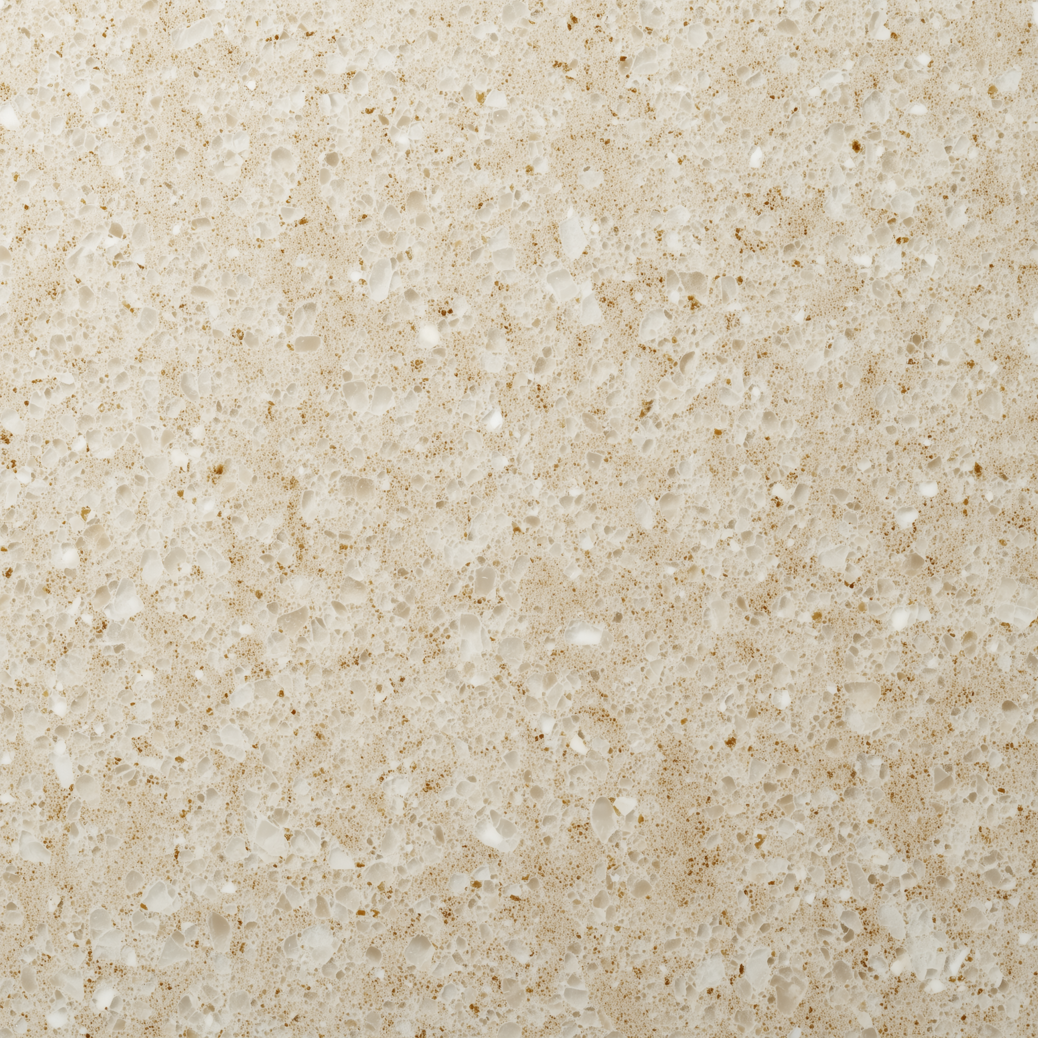
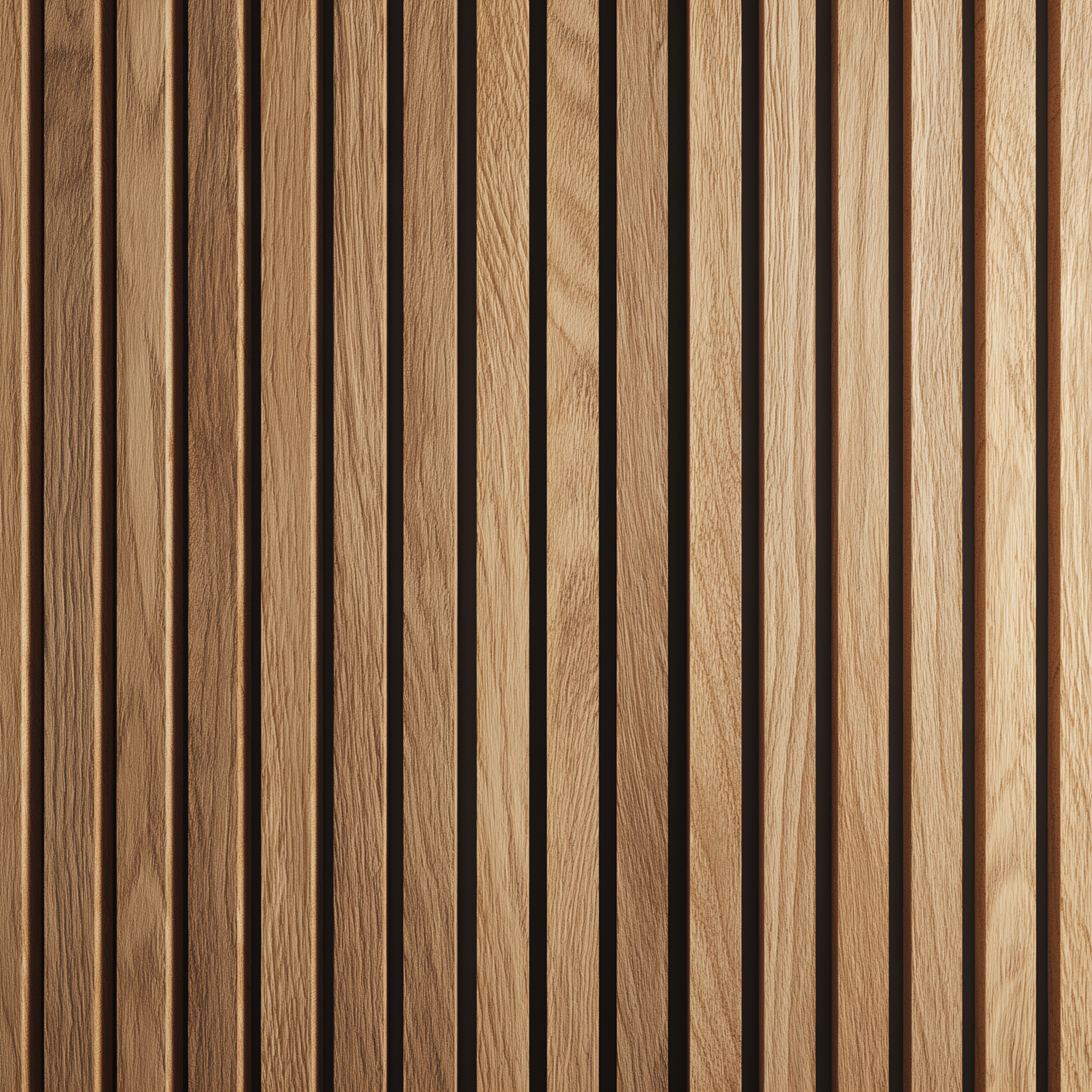
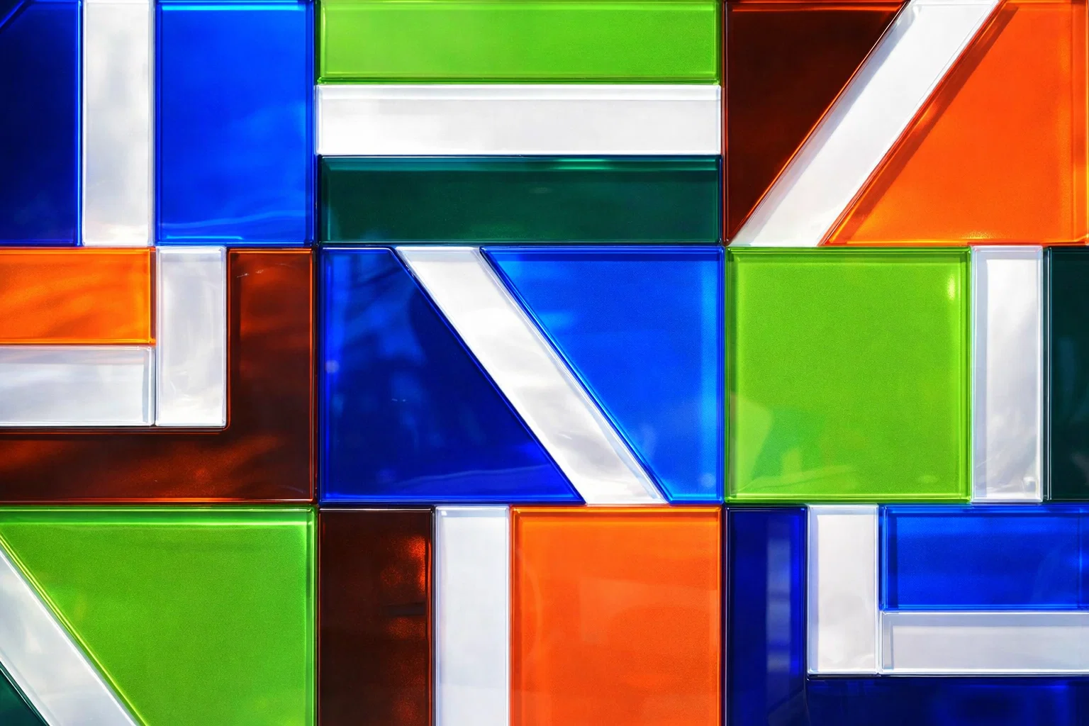
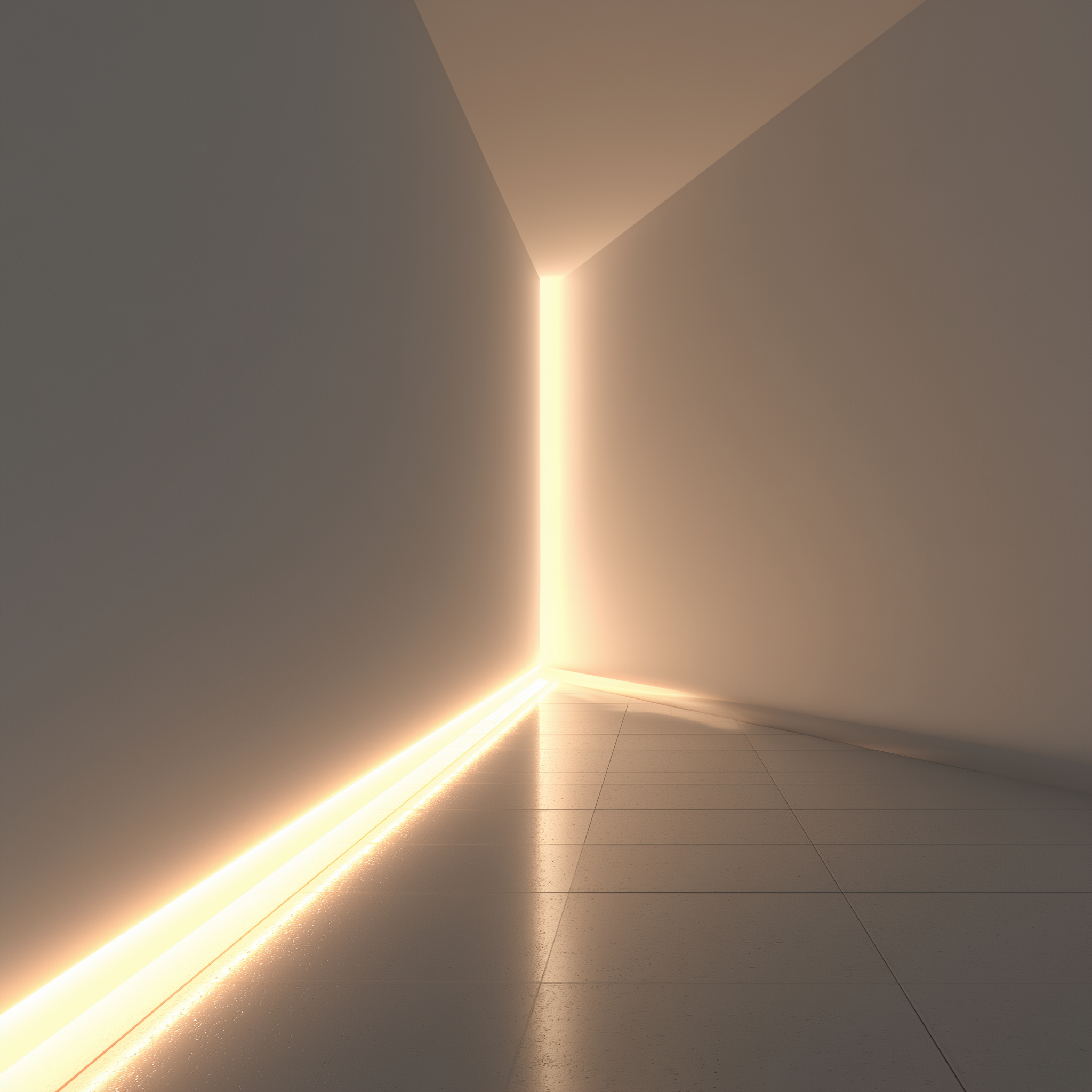
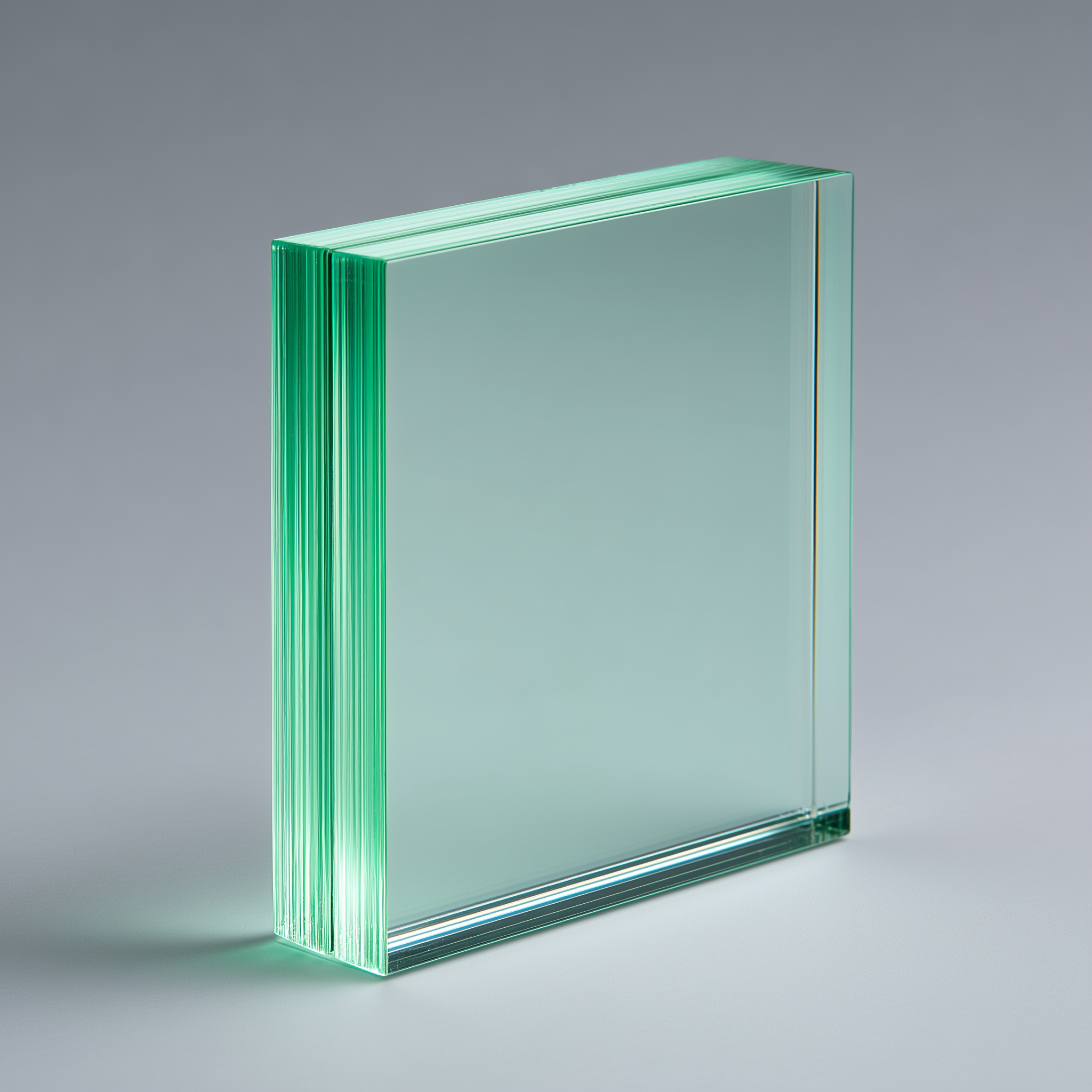
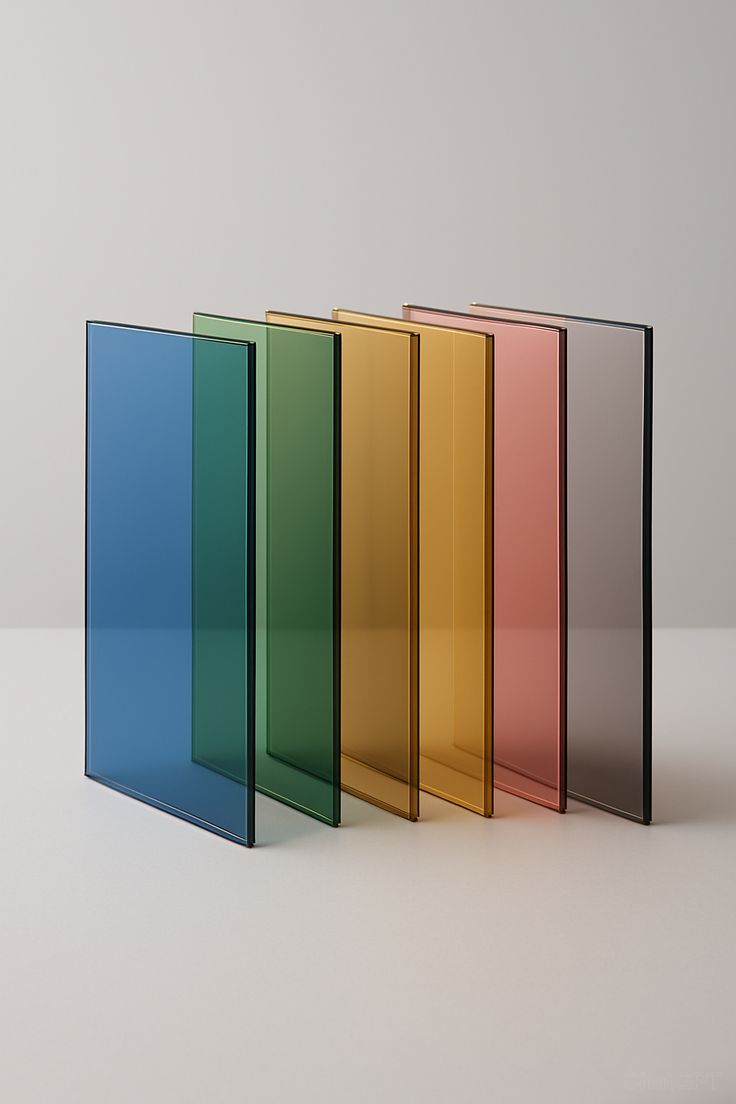
These are some examples of materials that could be used in our branded environments, such as offices, exhibition and sales centres.

Photography
The following is an overview of the brand photography style. These images should be a foundation to build a wider image library for the Balubaid brand.
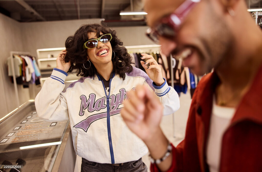
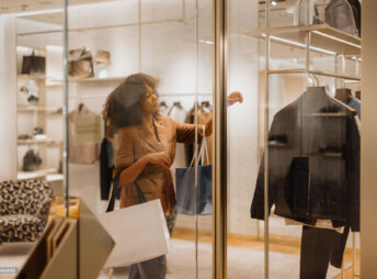
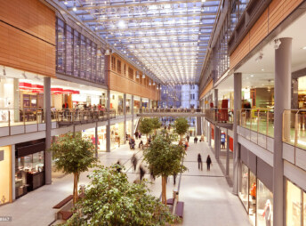
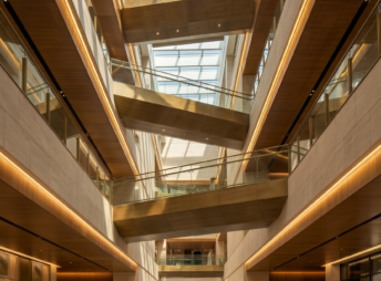
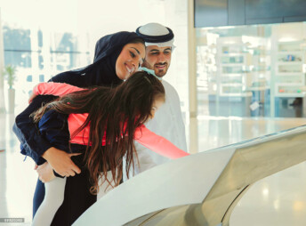
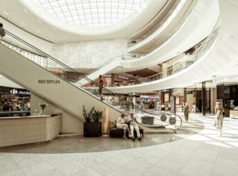
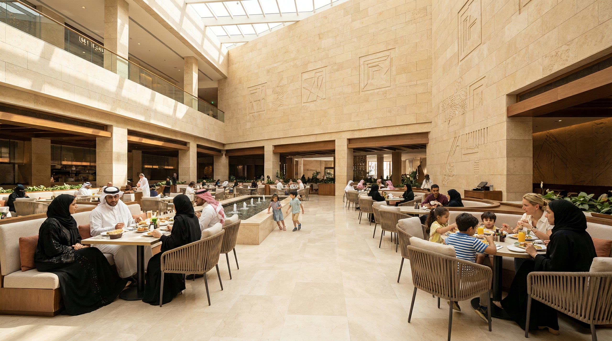
Malls photography
Places for Connection.
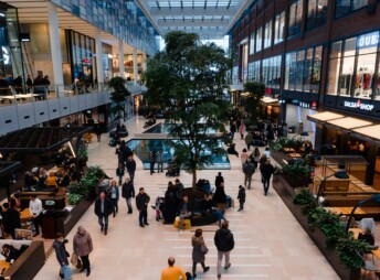
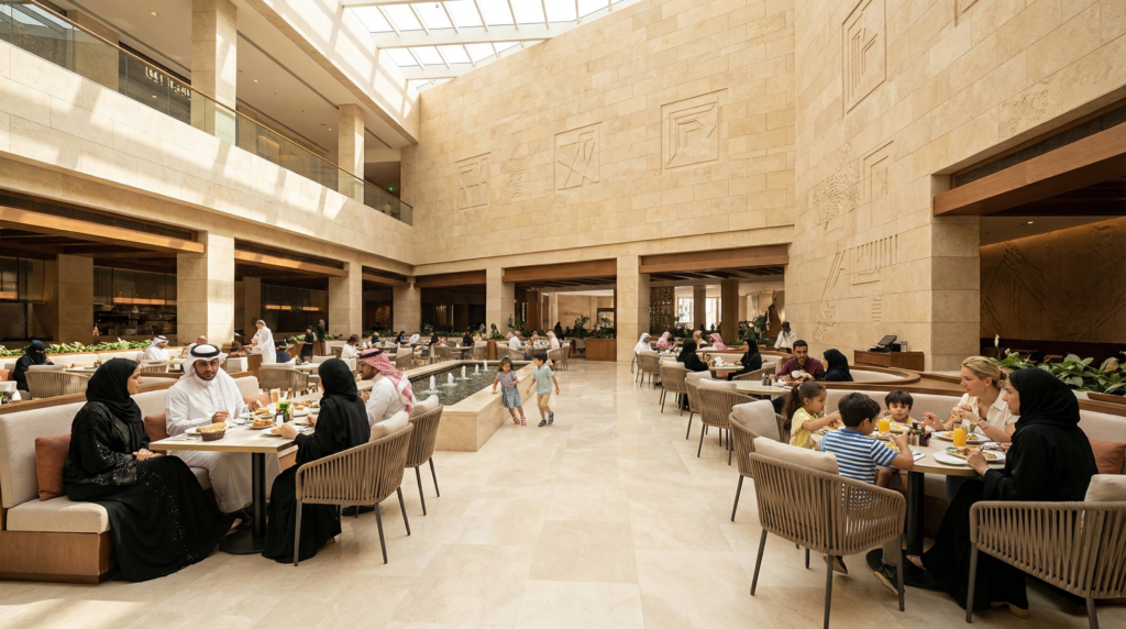
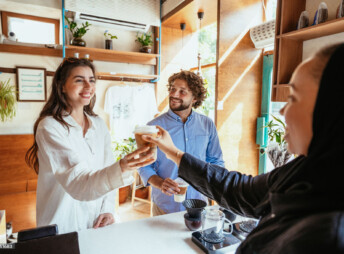
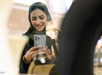
Amakenna Malls photography captures places as living environments, not just destinations.
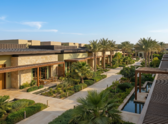
Amakenna mall photography captures social life, movement, and everyday encounters within public and retail environments. People are shown shopping, dining, browsing, meeting, and spending time together in a relaxed, natural way. The emphasis is on atmosphere and flow—malls are presented as social and civic spaces, not retail stages or promotional scenes.
People appear naturally within the environment, scaled to the architecture and never dominant, reinforcing Amakenna’s belief in malls as civic, social, and cultural places.
Lighting and colour are natural, warm, and grounded in realism.
Natural daylight is prioritised, complemented by soft architectural lighting that reveals texture and depth without drama. The colour palette remains warm-neutral, allowing stone, glass, timber, and greenery to read honestly. Heavy contrast, artificial saturation, and lifestyle clichés are avoided. The overall mood is modern, human, and enduring, positioning Amakenna Malls as thoughtfully designed places that matter, built for long-term life and use.
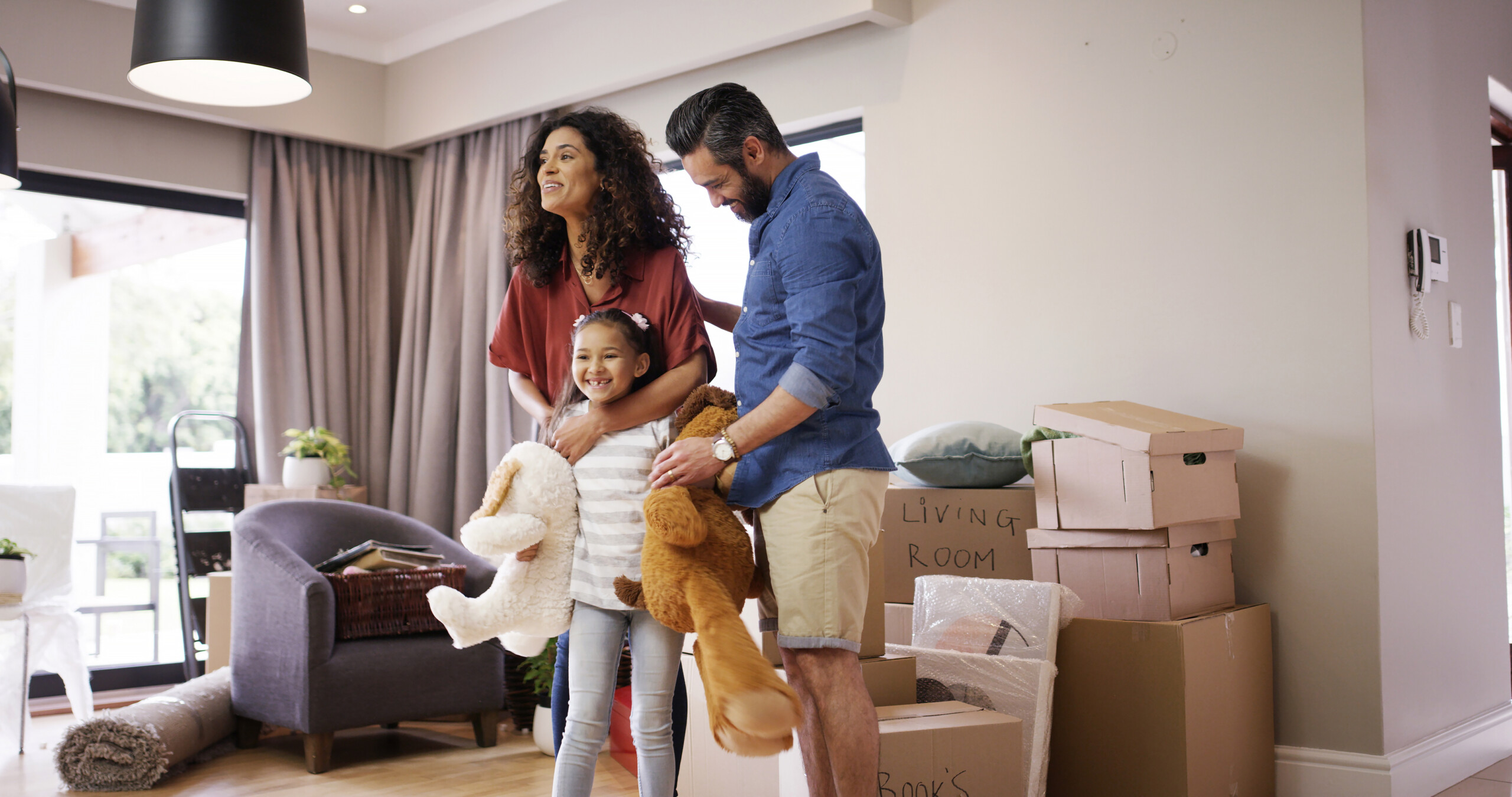
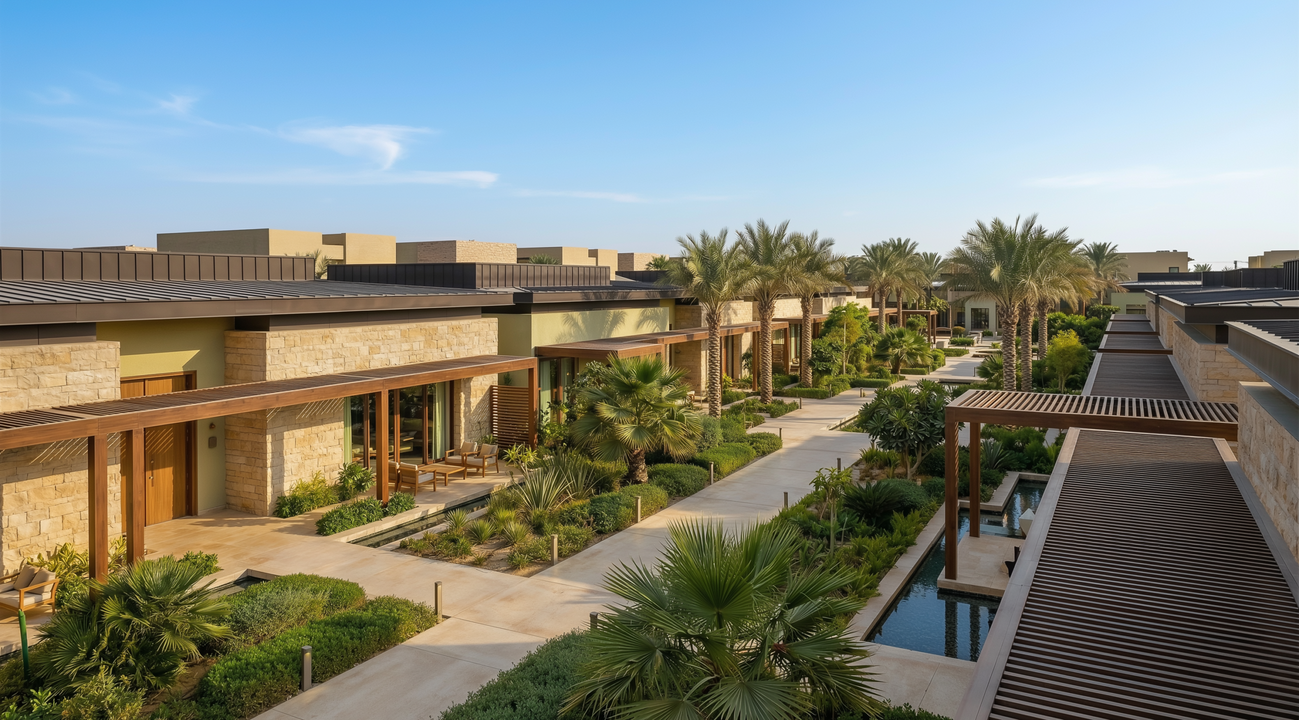
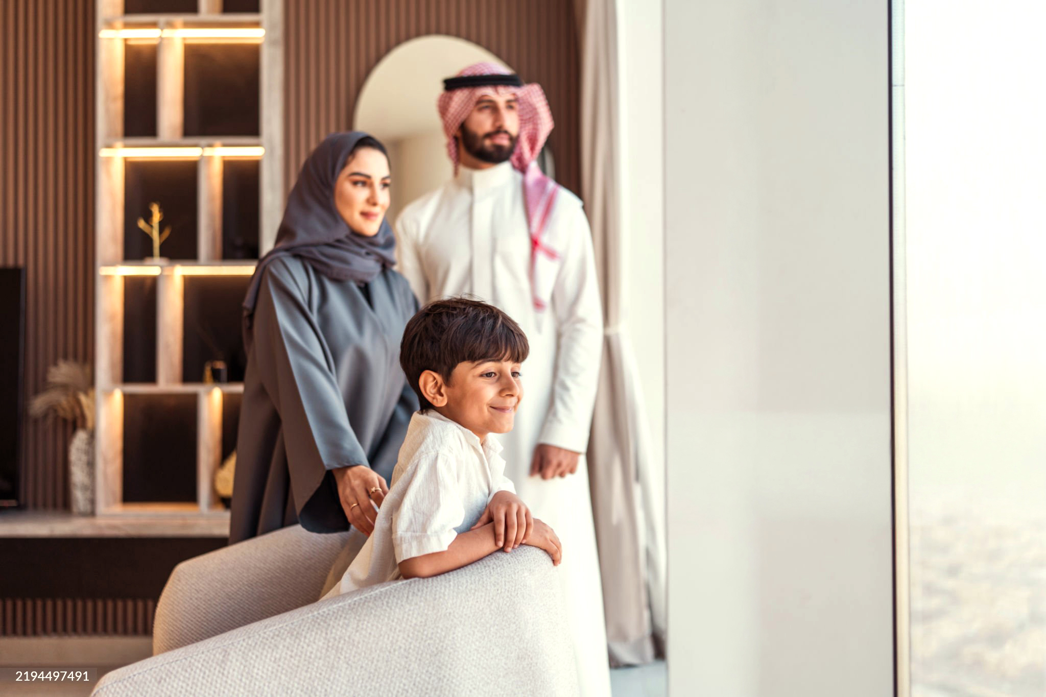
Residential photography
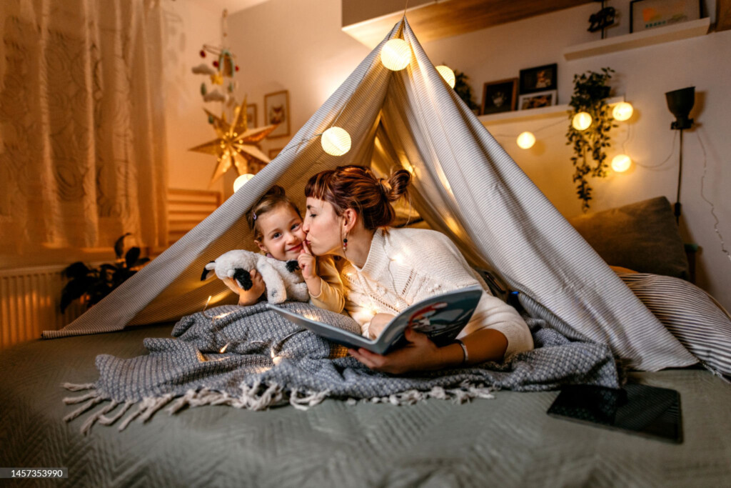
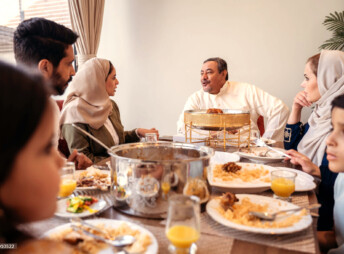
Places for Life.
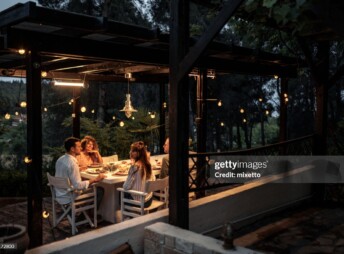
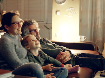
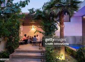
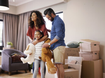
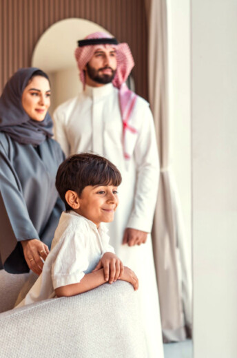
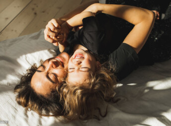
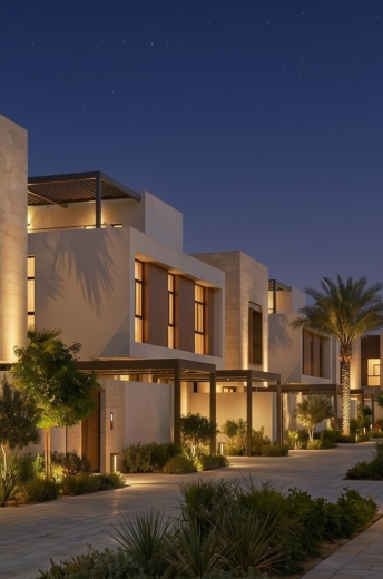
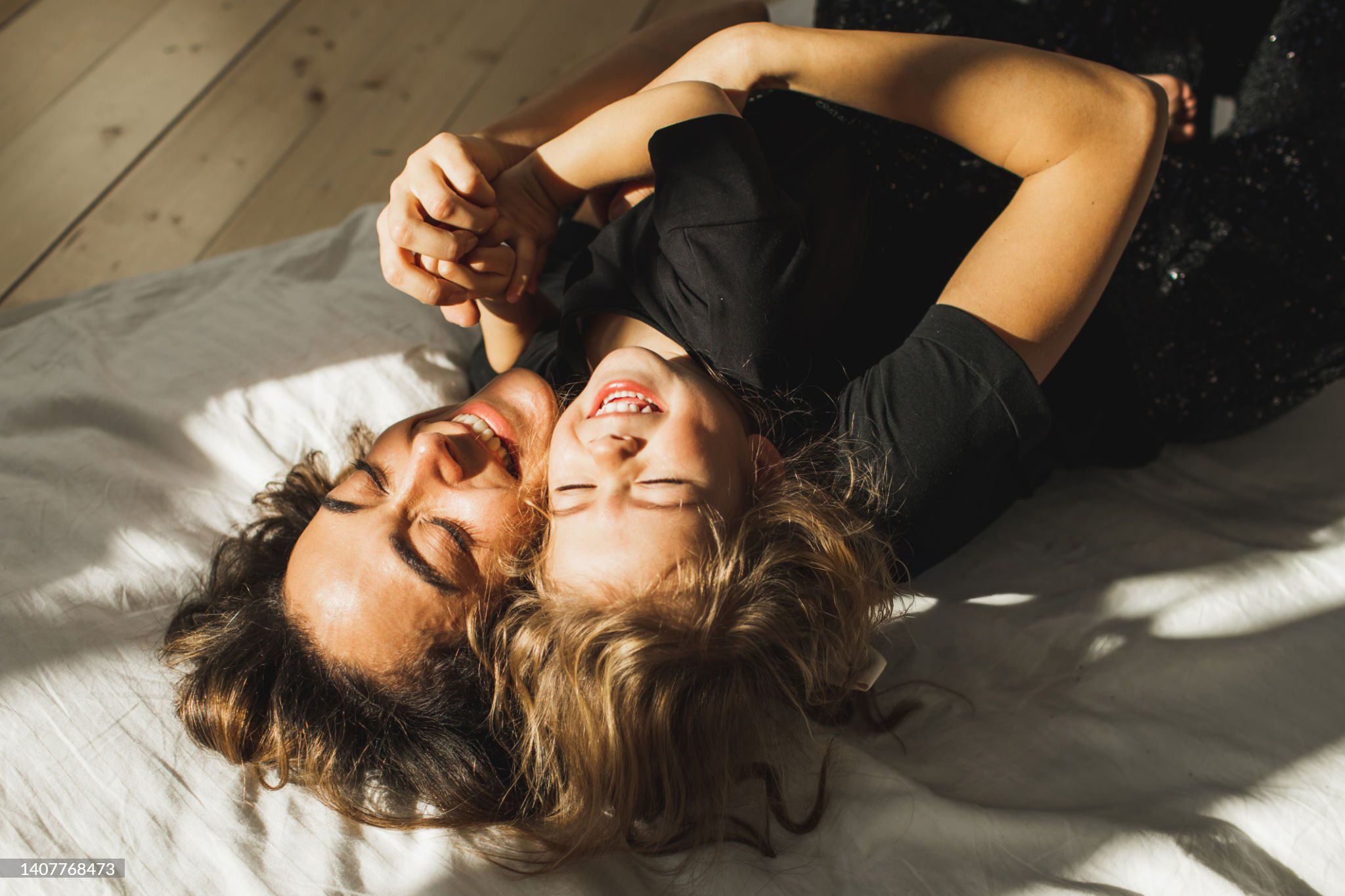
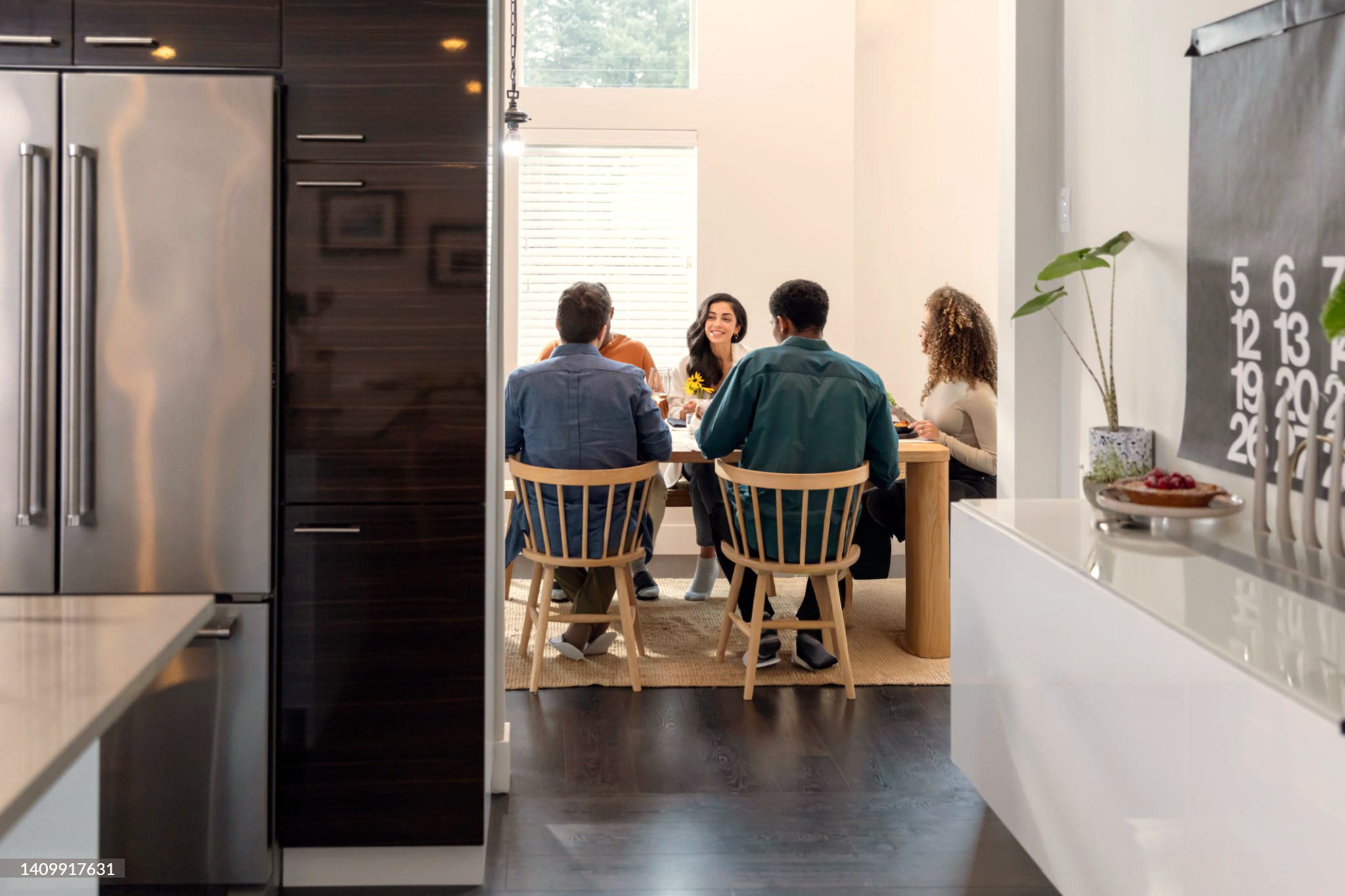
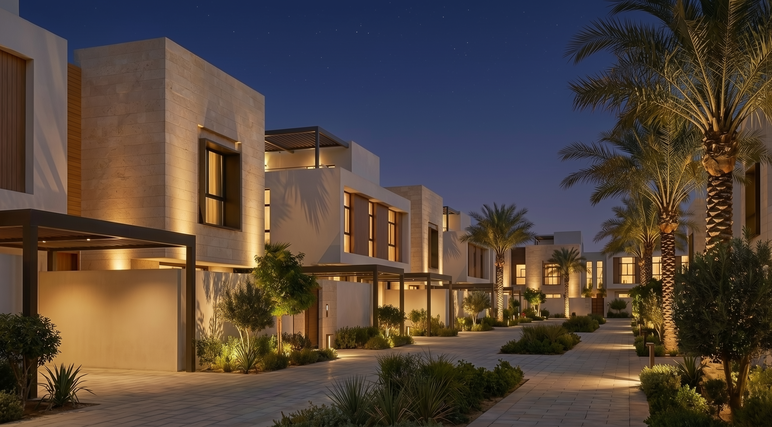
Amakenna Residential photography presents homes as calm, lived-in environments designed for everyday life.
Amakenna residential photography captures everyday life as it naturally unfolds within homes, streets, courtyards, and neighbourhood spaces. People are shown as part of a lived-in community—families, neighbours, and multi-generational moments that feel calm, familiar, and authentic. Interactions are informal and unstaged, reflecting belonging, comfort, and continuity rather than lifestyle aspiration or display.
Lighting and colour are soft, warm, and rooted in real life.
Natural daylight is prioritised, complemented by gentle evening and night-time architectural lighting that enhances warmth and safety without theatricality. Colours remain warm-neutral and authentic, allowing stone, plaster, timber, planting, and sky tones to read honestly. Heavy contrast, artificial saturation, and lifestyle clichés are avoided. The overall mood is serene, modern, and enduring—communicating residential quality, care, and a sense of home built for life.

Commercial photography
Places for Progress.
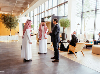
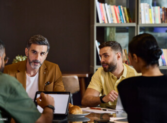
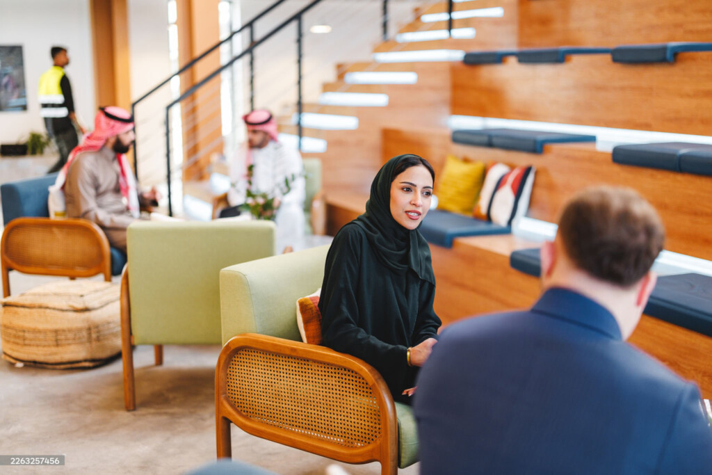
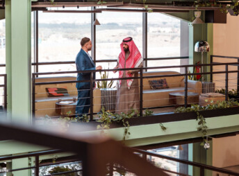
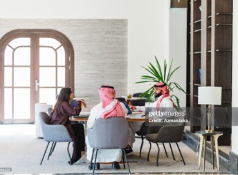
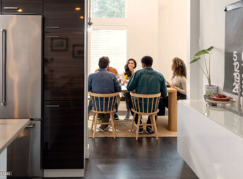
Amakenna Commercial photography presents workplaces as purposeful, human-centred environments.
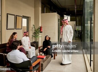
Amakenna photography presents work as human activity rather than corporate performance. People are captured in moments of collaboration, focus, discussion, and movement within offices, meeting spaces, and shared environments. Interactions feel purposeful yet natural—listening, exchanging ideas, transitioning between spaces—never posed, theatrical, or exaggerated.
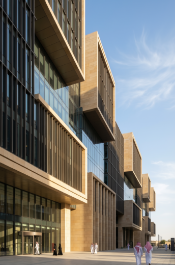
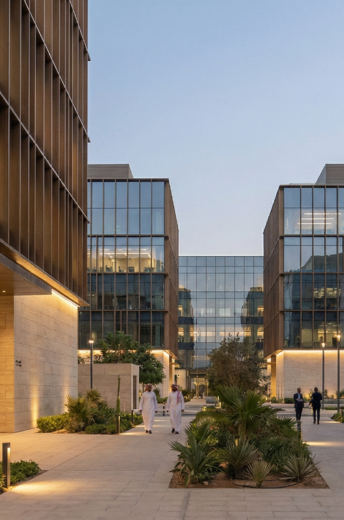
Lighting and colour are natural, warm-neutral, and materially honest.
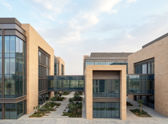
Daylight is prioritised to reveal form, texture, and depth, supported by soft architectural lighting that enhances volume without drama. The palette remains restrained and contemporary, allowing stone, glass, metal, and landscape to read authentically. Heavy contrast, artificial saturation, and glossy corporate aesthetics are avoided. The overall tone is composed, modern, and enduring—communicating commercial confidence without aggression, and progress without excess.